Frutiger C2
Frutiger C2
Scorte ridotte: ne restano 4
Limited Edition 90 Pieces

Inspiration
Our Frutiger frame style is inspired by the Frutiger typeface, created in France in 1975 by the skilful hands of the Swiss Adrian Frutiger, as a typeface to be adopted for the signage of the newly established Charles De Gaulle Airport in Paris. The key feature of Frutiger’s typeface is its high readability, even on a very small scale, thanks to the large kerning and the very prominent ascending and descending rods. Essential, authoritative, but pleasingly harmonious, it has an exquisitely contemporary character.
Fun Fact
Frutiger stated that a letter follows the same canonsof beauty as a face: a beautiful letter is perfect in
proportions. If the bar of a ‘T’ is set too high, or if the curve of an ‘A’ is set too low, this disproportion jars like Frame style ID
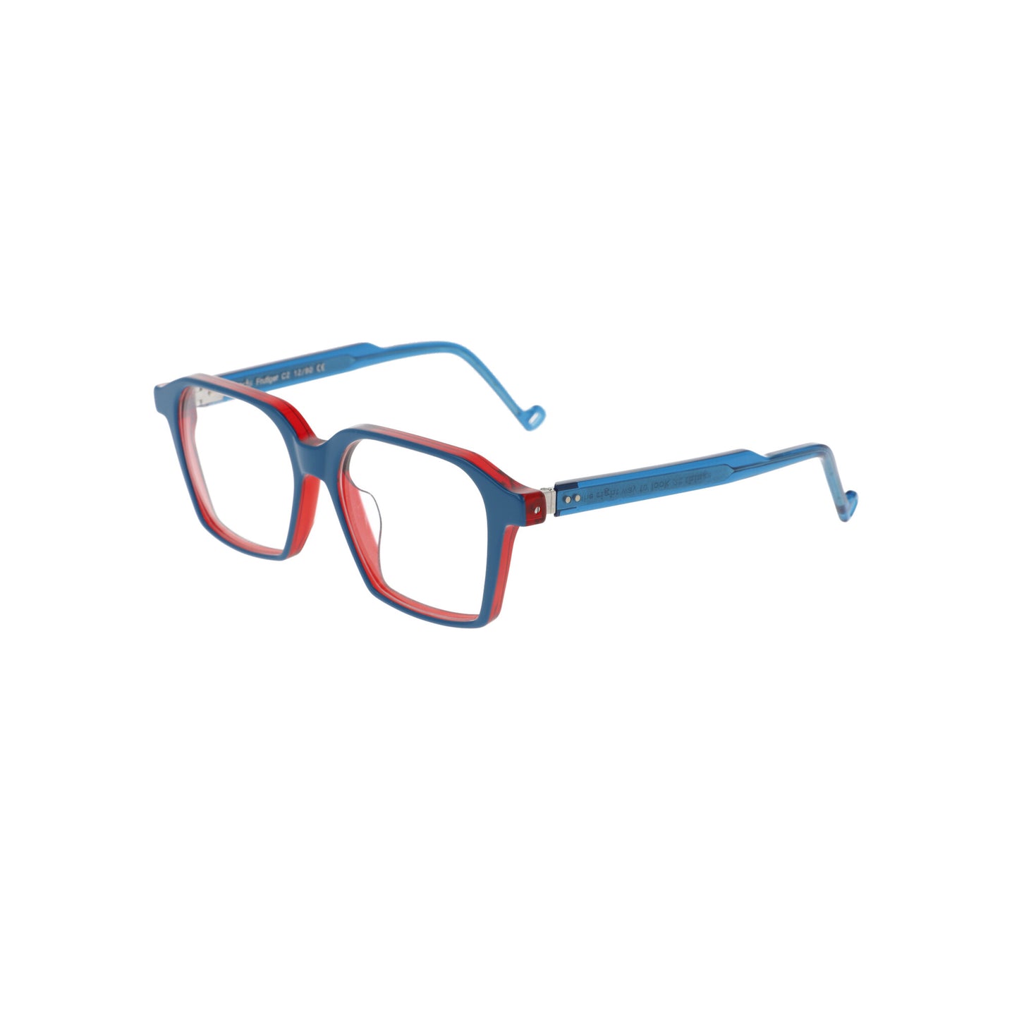
Frame front: The frame front reproduces the original font design in proportion to the thicknesses between the relatively homogeneous horizontal and vertical temples and the inclination of the ascending and descending temples. The resulting frame has a delicately retro-futuristic taste, linear but not lacking
in character.
Temples: The temple is attached to the front via a UPN hinge through two riveted rivets, leaving
the metal hinge visible. The perforated ‘O’ from the Good’s branding is reproduced at the edge of each
temple.
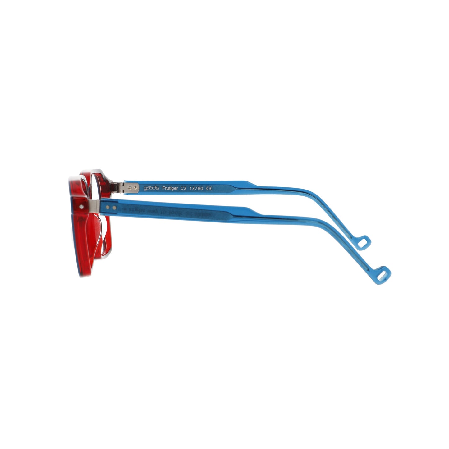
Core: Visible from the outside due to the subtle transparency of the acetate and made to an exclusive
Good’s design, it reproduces - with an engraved inscription - the right way to look at things developed
from right to left, like the lead lines produced by the traditional Linotype typographic machine, invented in 1886 and defined by Thomas Edison as The Eighth Wonder of the World.